You know how each year the Pantone Color Institute provides color trend forecasting that guides us as individuals and brands in the fields of graphic design, fashion design, product design and manufacturing. Now, Pantone has teamed with the leading global marketplace in the wedding industry WeddingWire in order to deliver inspiration to couples planning to tie the knot by the end of the year.
Let’s have a quick look at the shades.
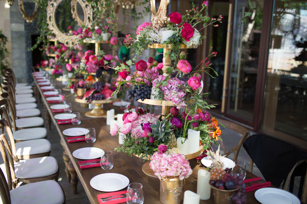
- Love in Bloom

Colours: soft and nurturing shades contrasted with bold hues such as fuchsia and red; earthy green; shimmering silver metallic; rose gold.
“Love in Bloom leans to the warm side of the spectrum with its visual portrayal of comfort and enjoyment, affection and contentment. Blending nostalgia with new, Love in Bloomtakes an innovative approach to romantic love.”
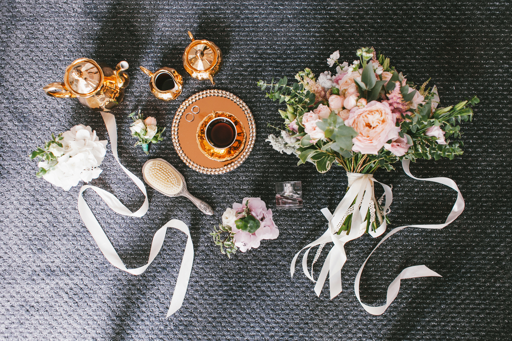
- Golden Hour

Colours: warm neutrals; apricot; cappuccino; pale gold.
“A palette of easy and uncomplicated honest colors, Golden Hour celebrates the physical beauty of nature. The palette has a modern, fresh twist on typically traditional colors, and the addition of a pale gold and copper metallic act as a highlight, enhancing and further increasing the palette’s organic and unconventional appeal.”
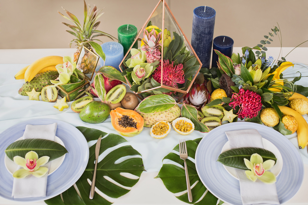
- Paradise Found

Colours: vibrant shades of blue, orange, turquoise; playful pink; teal.
“Paradise Found represents a refreshing escape to an idyllic destination, no matter where the couple’s wedding is located. The playfulness of the palette invites couples to mix and match wedding party attire – including groomsmen suiting and accessories in fun colors across the spectrum. Signature cocktails can also serve as artwork and decor.”
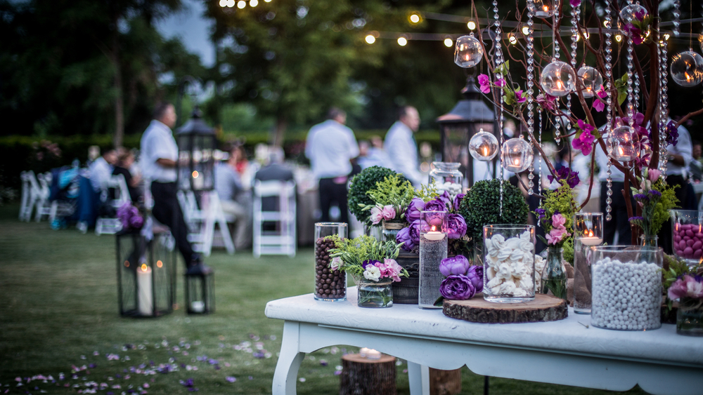
- Stroke of Midnight

Colours: dark shades of blue and all shades of purple; cool metallic.
“Stroke of Midnight celebrates the powerful energy and magic surrounding the beginnings of a new chapter for couples.”
Which combination will you pick for your dream wedding?